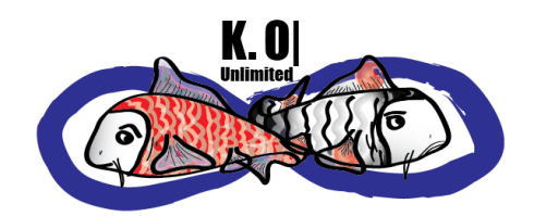
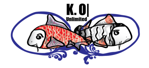
So here’s the back story on the logo. My first initial and last name spell koi like the fish, so I wanted to incorporate the koi fish element in my logo design. The name of my company is K. O| unlimited and the original logo concept for that included the use of the symbol for infinity and I’d like to keep that logo element as well. So I have one overall design and a slight modification of that design that I’m choosing from. Tell me what you think?
or


Hey Krystena!
I voted for the second one bc of the symbolic meaning behind it.
The symbol just truly reflects who you are in every sense including your profound faith in God.
I don’t want to change your logo at all but just wondering how’d you feel about flipping the fleur de lis and placing it on top of the eternity symbol bc of it’s symbolic meaning for the Holy Trinity. If not you could place it both on top/bottom, or maybe on the right side at the top and left side at the bottom or just on the sides. Maybe put it in the center of the eternity symbol one at top and the other at the bottom. Or putting the fleur de lis inside the eternity symbol which would almost make it look like the koi fish being in water (water symbolizes purity and some may view it as a sign of fertility as well.
Sorry I got a bit carried away…just wanted to throw those ideas out there. lol. Either way definitely go with the second one. :] XoXo…